.svg.png)

The Challenge
It’s meant to help, but ended up overwhelming users
M365 offers a wide range of services, and FastTrack was designed to guide users through adopting them.
However, as more tools and content were added, the experience became increasingly fragmented and overwhelming. Instead of simplifying onboarding, it risked confusing users who struggled to find relevant solutions.
The product clearly needed a more scalable, cohesive experience to help users discover and adopt M365 services with confidence.
approach & Process
Design a scalable, user-informed self-guided experience that improves discoverability and increases adoption.
This was a self-led, multi-phase effort spanning several quarters. I guided the strategy and design across evolving milestones, grounding each phase in user feedback and iteration.
Iteration 1
- UX audit of existing experience
- Simplified navigation and reduced cognitive load
Iteration 2
- Personalized onboarding pathways
- Usability testing & A/B testing to validate new design
Iteration 1
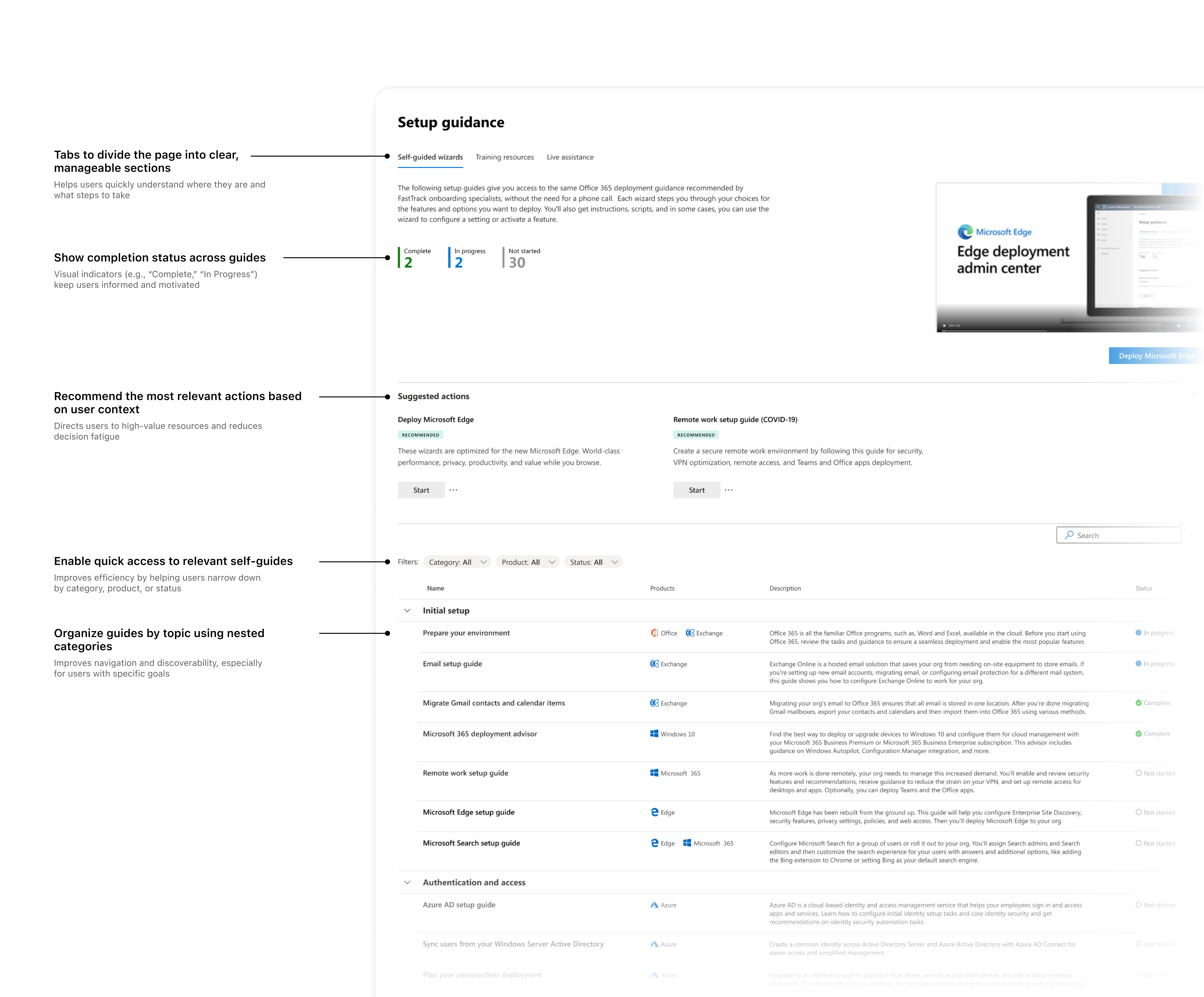
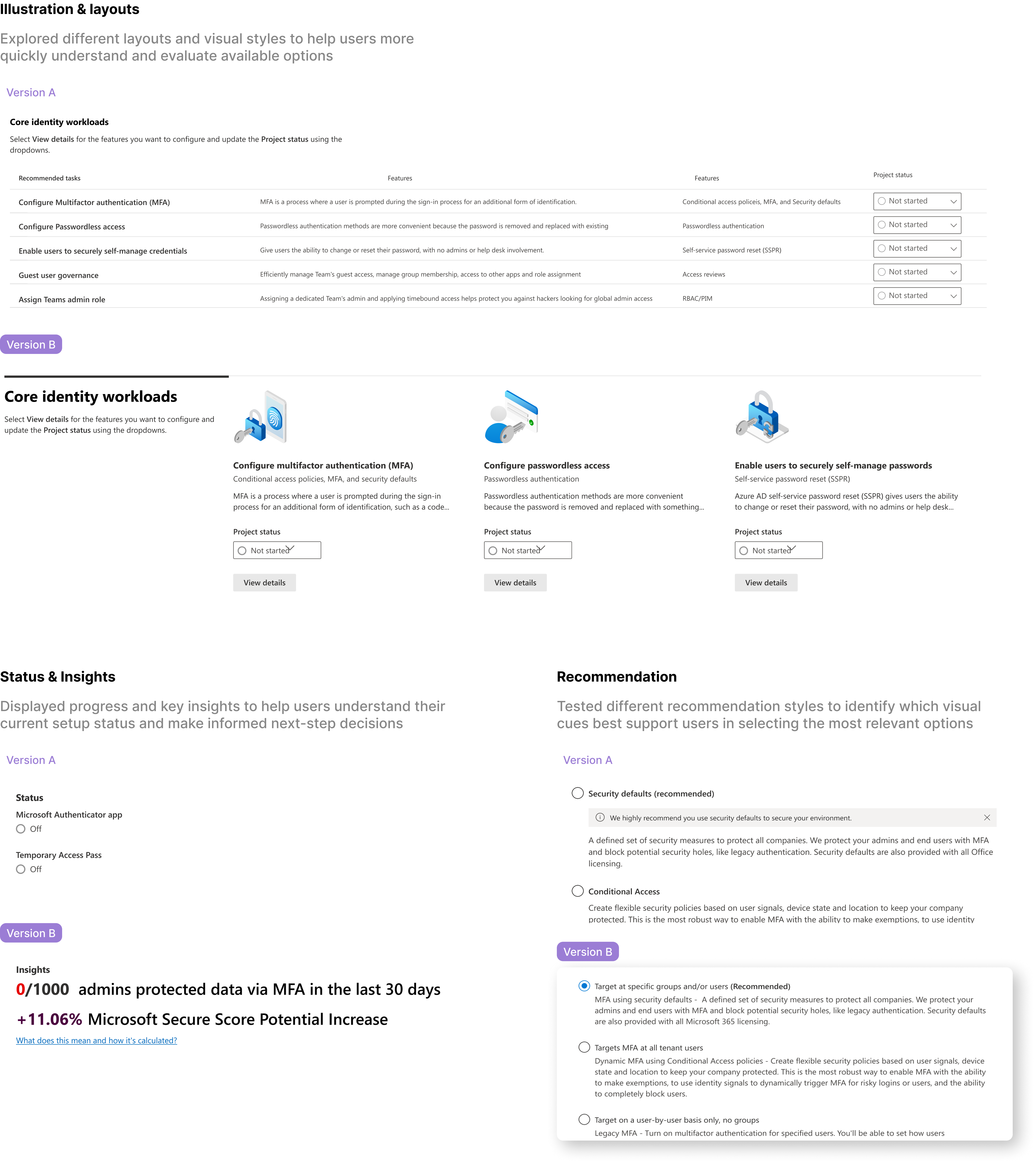
Restructuring the landing page for clarity
To reduce friction in the onboarding flow, I:
- Audited user flows to surface pain points
- Reorganized layout based on task intent
- Grouped setup actions by priority to streamline decisions
To support better decision-making, I introduced progress indicators and a simplified layout that guides users step by step.
Outcome: These changes established a scalable, task-based navigation model that better aligned with how users approached setup.
Iteration 2
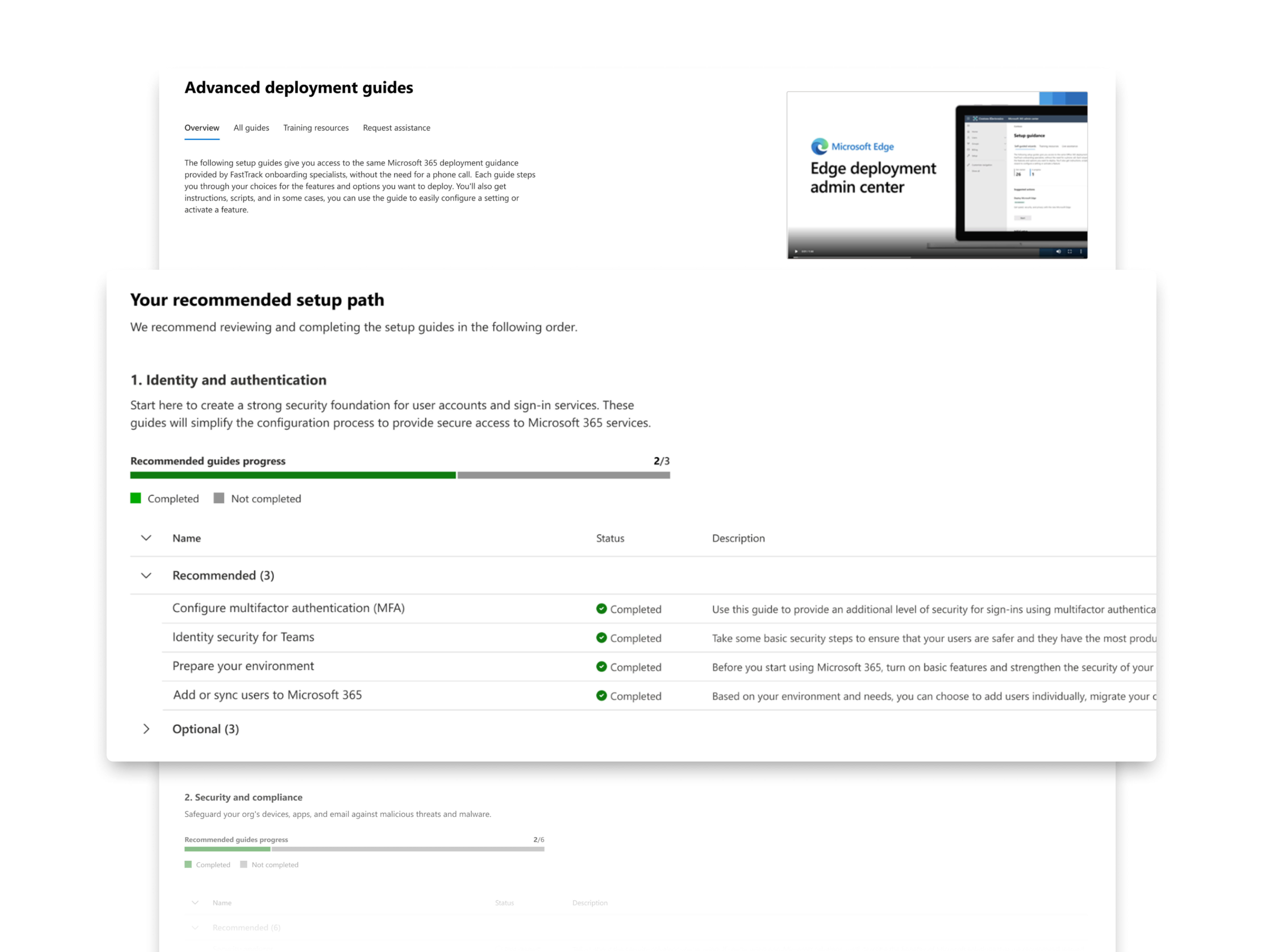
Personalizing the Setup Journey
To improve relevance and confidence, I introduced personalization into the self-serve flow. To make the journey more relevant and intuitive, I:
- Collaborated on backend logic to support dynamic guide recommendations
- Designed a rules-based system to surface relevant tasks
- Validated flow via usability and A/B testing
Usability testing
I conducted usability testing to test out the new design. It was 1:1 usability testing with 6 participants
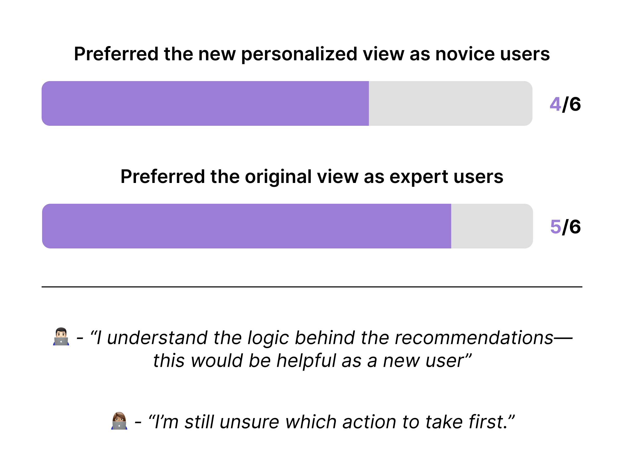
Insights: Users preferred personalized flows over static content, leading to faster decision-making and higher completion rates — a win for confidence and clarity.
Final Iteration
Testing, Refinement & Expansion
In the final phase, I focused on validating the scalability of the UI model and ensuring it supported both clarity and ease of use.
I tested layout variations to assess how well users could navigate and complete setup tasks.
Usability testing
efore finalizing the design, I ran one last round of usability testing to evaluate layout effectiveness — specifically how easily users could scan categories and take next steps.
Insights: Users consistently preferred the fixed in-page layout, which offered clearer structure and helped them stay oriented across tasks.

A/B testing
Alongside usability tests, I collaborated with engineers to run A/B experiments across message styles, iconography, and layout variants.These tests helped validate the most effective UX for confident decision-making.
Insights: Users found simple visuals more approachable and preferred clearer, actionable wording. Message bars felt intimidating — so we only surfaced them for unadvised choices, improving tone and guidance.
Final Design
The final design balances clarity, flexibility, and growth.
It simplifies navigation so users can explore setup guides with confidence—not confusion. By grouping content into focused categories, the flow helps users take the right next steps, one at a time.
It also scales effortlessly. Teams can add new guides or categories without disrupting the structure, keeping things organized as the product evolves. This is a thoughtful, future-proof solution—shaped by real user behavior and aligned with business priorities.

Reflections
Outcome
- Resulted in a 3x increase in service adoption
- 90% completion rate for new guides
- Flexible model adopted for future onboarding modules
Takeaways
- Designing for scale requires forward-thinking clarity — not just for users, but for future contributors and evolving content.
- Sometimes design isn’t about simplifying UI, but about guiding decisions. Progress indicators and task grouping made the experience more strategic than just “clean.”
- As a self-led effort, this project sharpened my ability to lead product conversations, navigate ambiguity, and advocate for end-to-end UX quality over time.