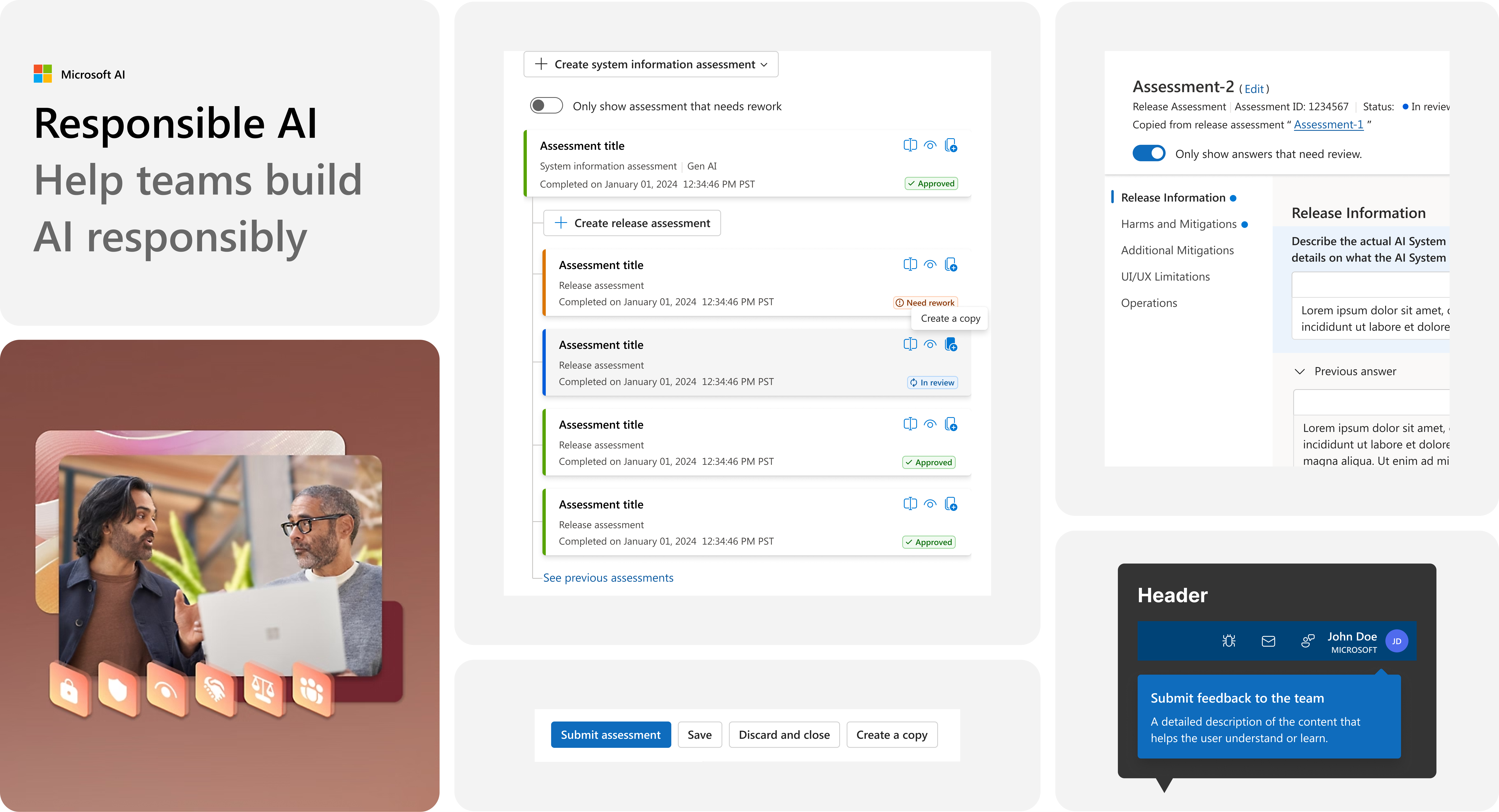
Overview | TLDR
An AI compliance system struggling to scale with rapid product growth
The Problem
As Microsoft rapidly shipped AI-powered features across its products, teams lacked a standardized way to evaluate AI safety, compliance, and responsible deployment.
Each team approached AI compliance differently, resulting in inconsistent experiences, duplicated effort, and increased compliance risk at scale.
My Role
I was a Product Designer on the One Responsible AI team, leading the design of the AI compliance experience to streamline how product teams assess, document, and review AI safety across Microsoft.
Key Gaps Discoverd
Excessive time spent on manual compliance work
Teams spending significant time creating and reviewing compliance documents manually
Overwhemling documents
A single change or release could require managing many compliance-related documents
Key features
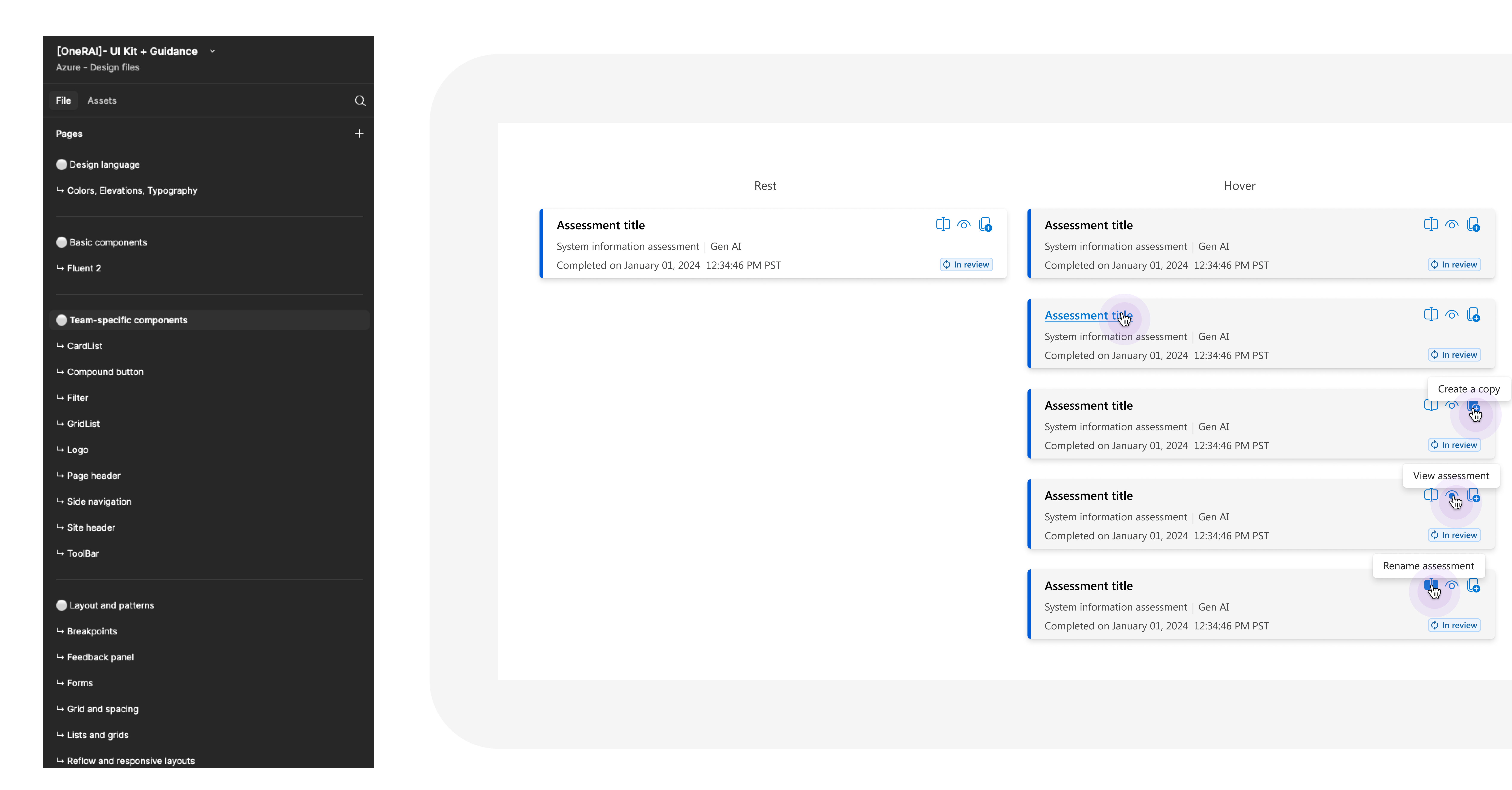
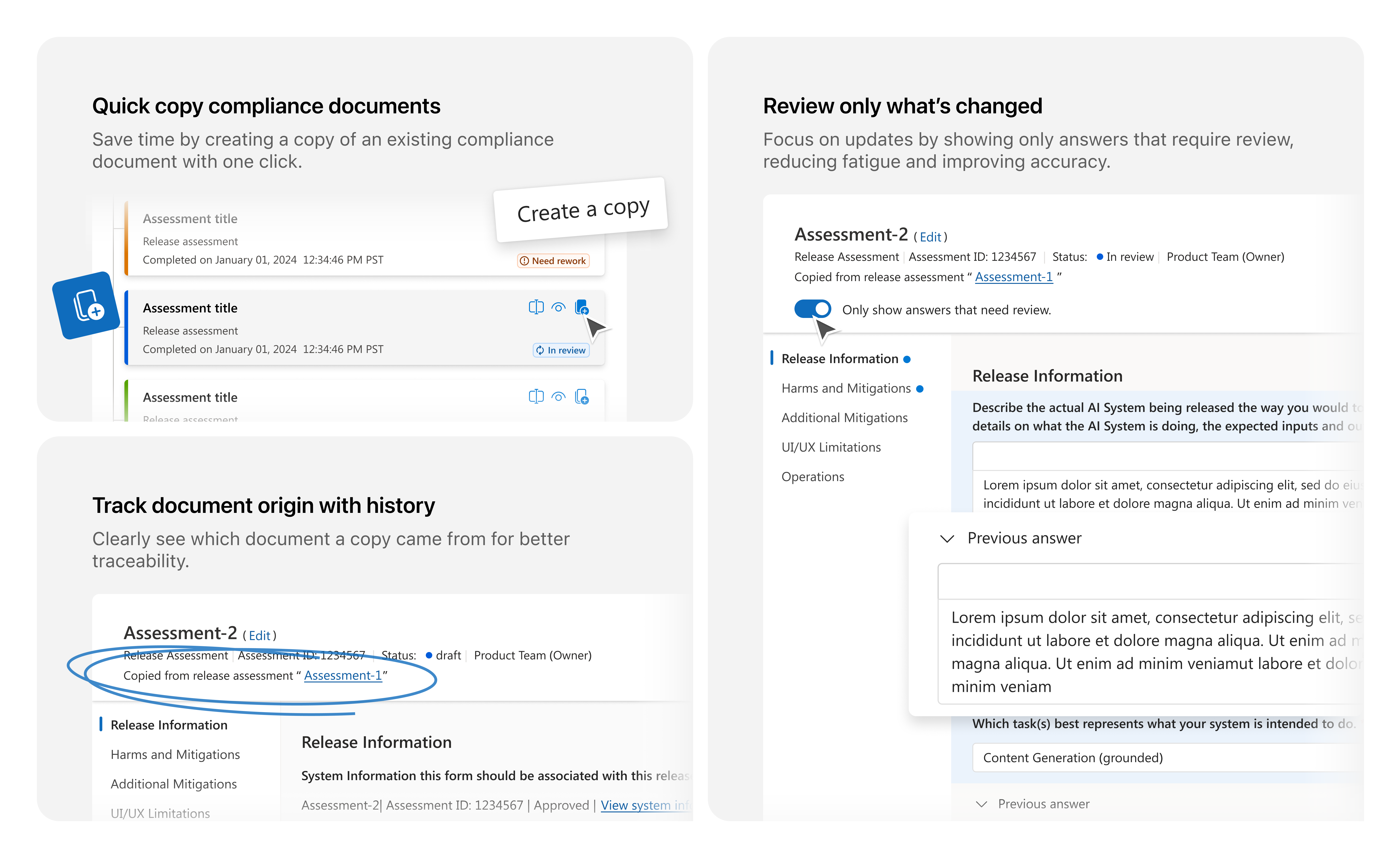
01. Quick copy
Create & review documents faster
Users are required to create documents for each AI release, which is time-consuming and error-prone, especially when much of the information is the same as previous submissions. This led to wasted time, inconsistencies, and made it hard for reviewers to track what had changed between versions.
As a solution, I designed the Quick Copy feature, allowing users to duplicate prior documents and review only what's changed. This reduced redundant entry, minimized errors, and eased reviewer fatigue.
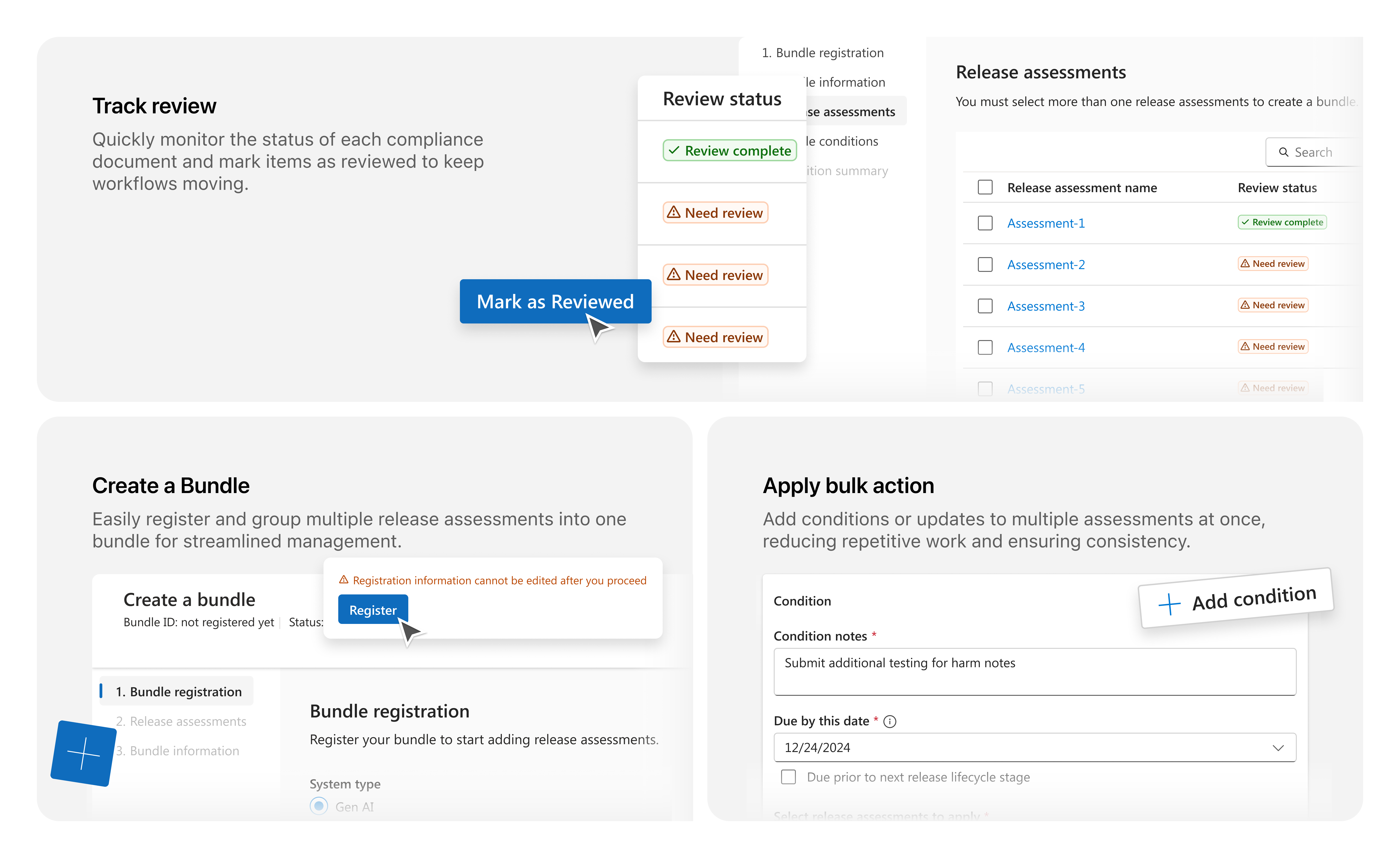
02. Bundles
Simplifying the review of related documents
As the number of compliance documents grew, reviewers struggled to manage and review them efficiently. There was no easy way to group related files, leading to fragmented review experiences and slower submission cycles.
As a solution, I designed the bundle feature, allowing users to package related files into a single, trackable group. This provided reviewers with a consolidated view, reduced review time, and simplified submission management.
Impacts
100% feature adoption and measurable reductions in review time and compliance friction
100% adoption rate after rollout
35%→ 20% long tail reviews
30%→ 20% cases requiring clarification
Raising qualities
Identifying opportunities to make the product more usable and accessible
Beyond designing key features, I identified opportunities to elevate overall product quality. This includes improving usability, improving the UX process, and strengthening accessibility to ensure a more reliable and inclusive experience.
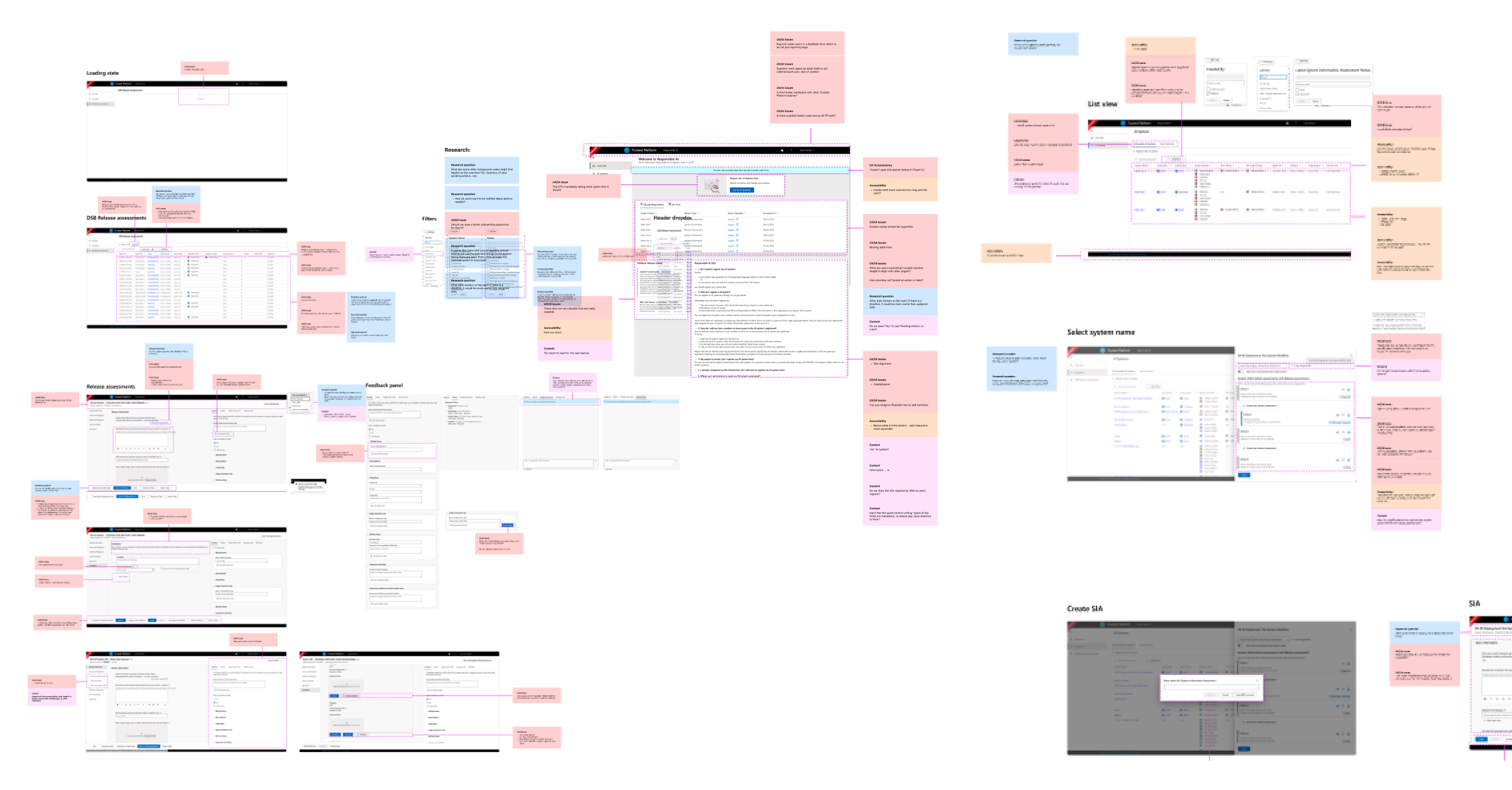
Scope & Planning
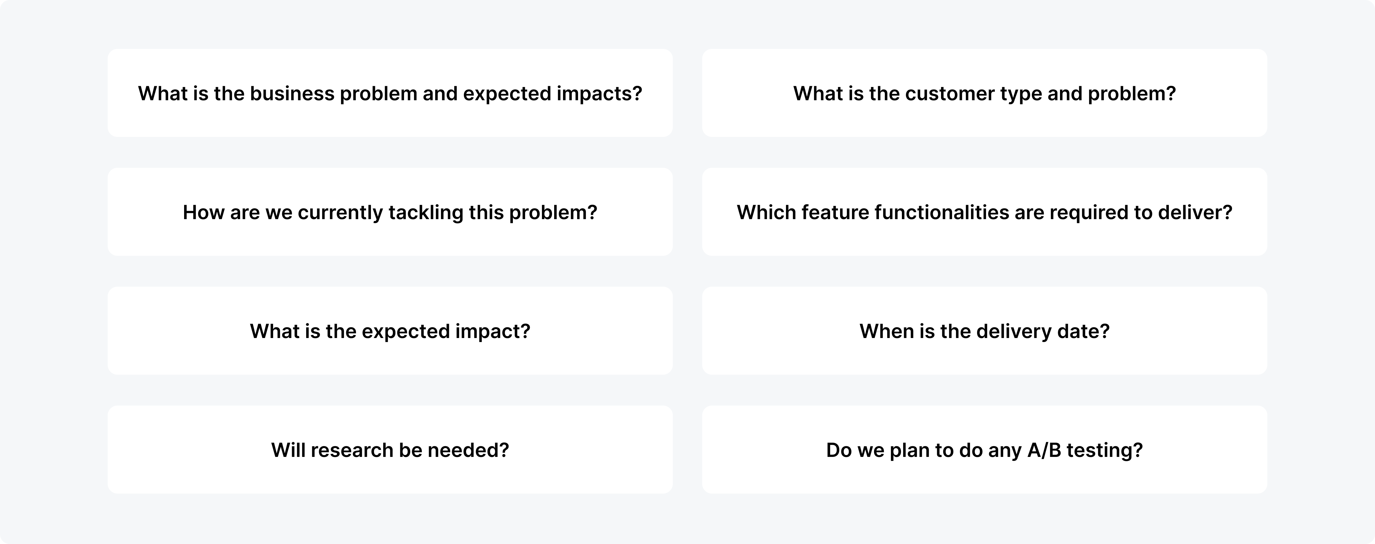
- Defined primary user types and mapped common use scenarios
- Audited current workflows for creating and reviewing compliance documentation
design process
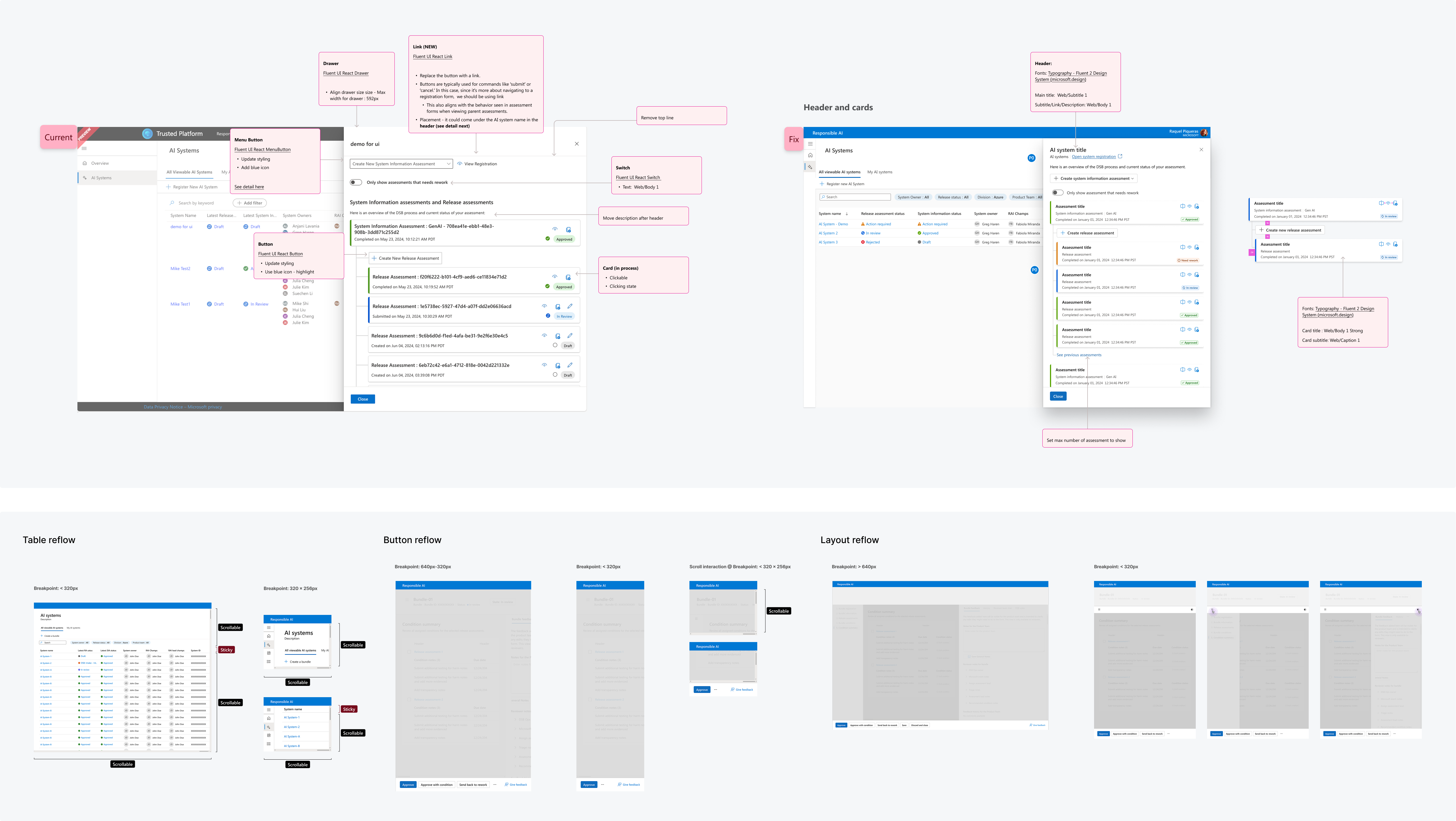
- Identified the optimal interaction point for Quick Copy within the existing UI
- Collected feedback from the UX team to validate flow and usability
design Delivery
- Shipped within ~2 weeks with PM alignment and internal feedback loop
- Created detailed design specs for engineering
- QA with PMs and engineers to ensure design & content accuracy
- Supported bug bash and final design polish
Addressing usability issues
Recurring UI issues were impacting consistency and efficiency. I conducted a UX audit, prioritized fixes, and collaborated with engineering to implement improvements.
Outcome: Resolved 50% of high-impact usability issues.
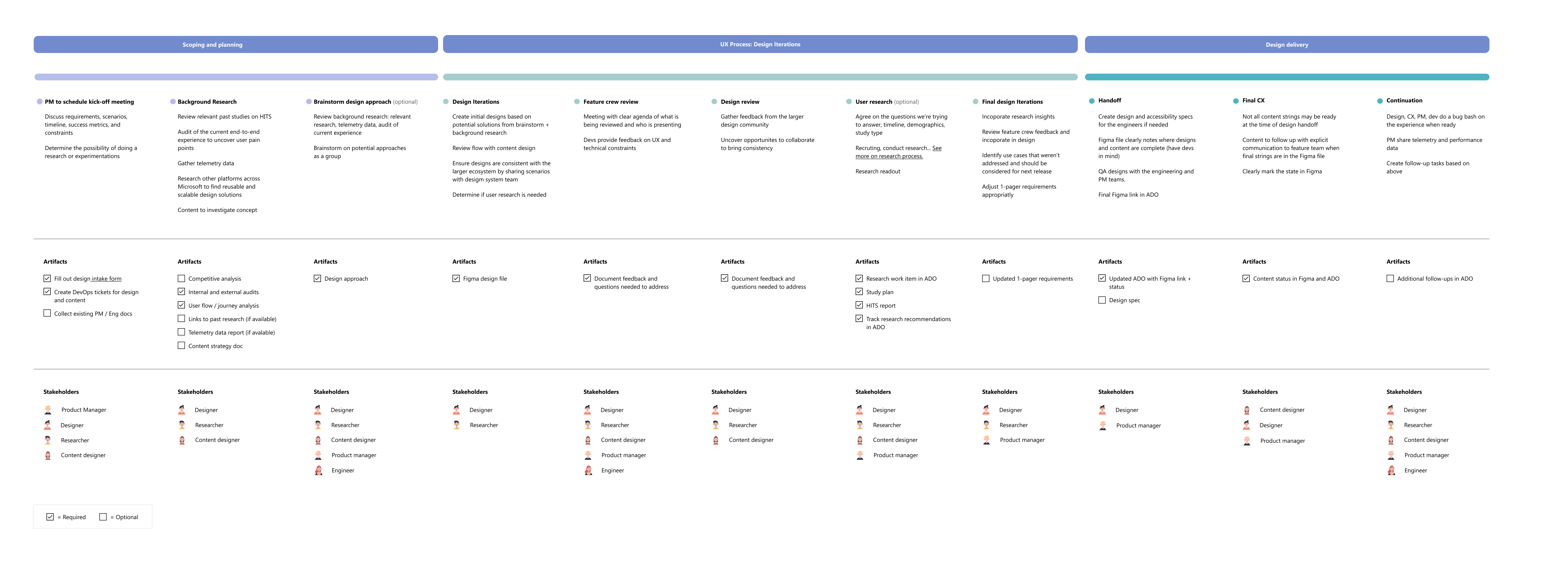
Establishing Intake&hand-off process
Partnered with PMs, designers, and engineers to align early on user pain points, goals, and effort. Integrated design reviews, accessibility checks, and clear specs into the process to catch issues before launch and ensure UX quality.
Outcome: Reduced back-and-forth and improved delivery efficiency.
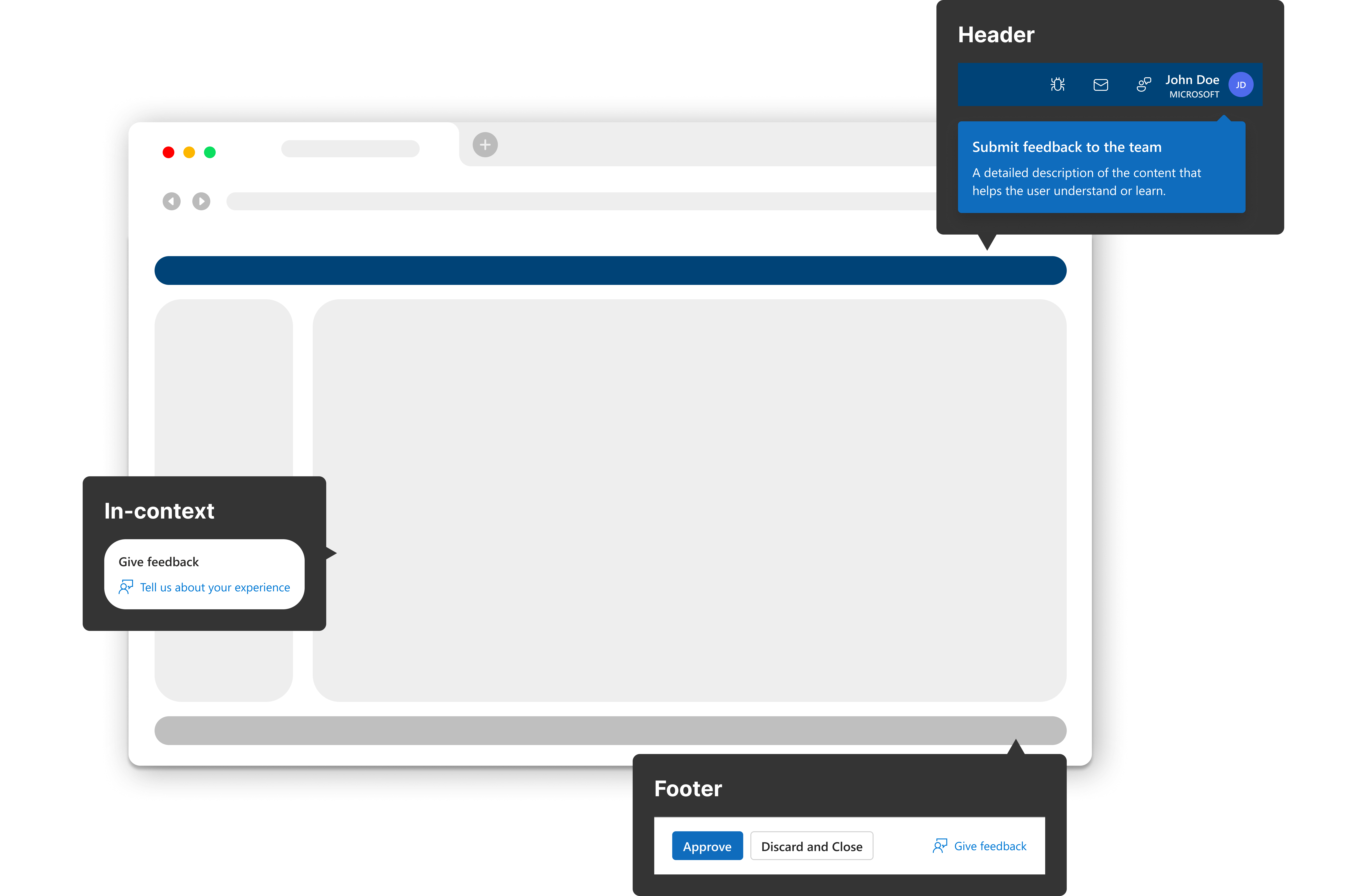
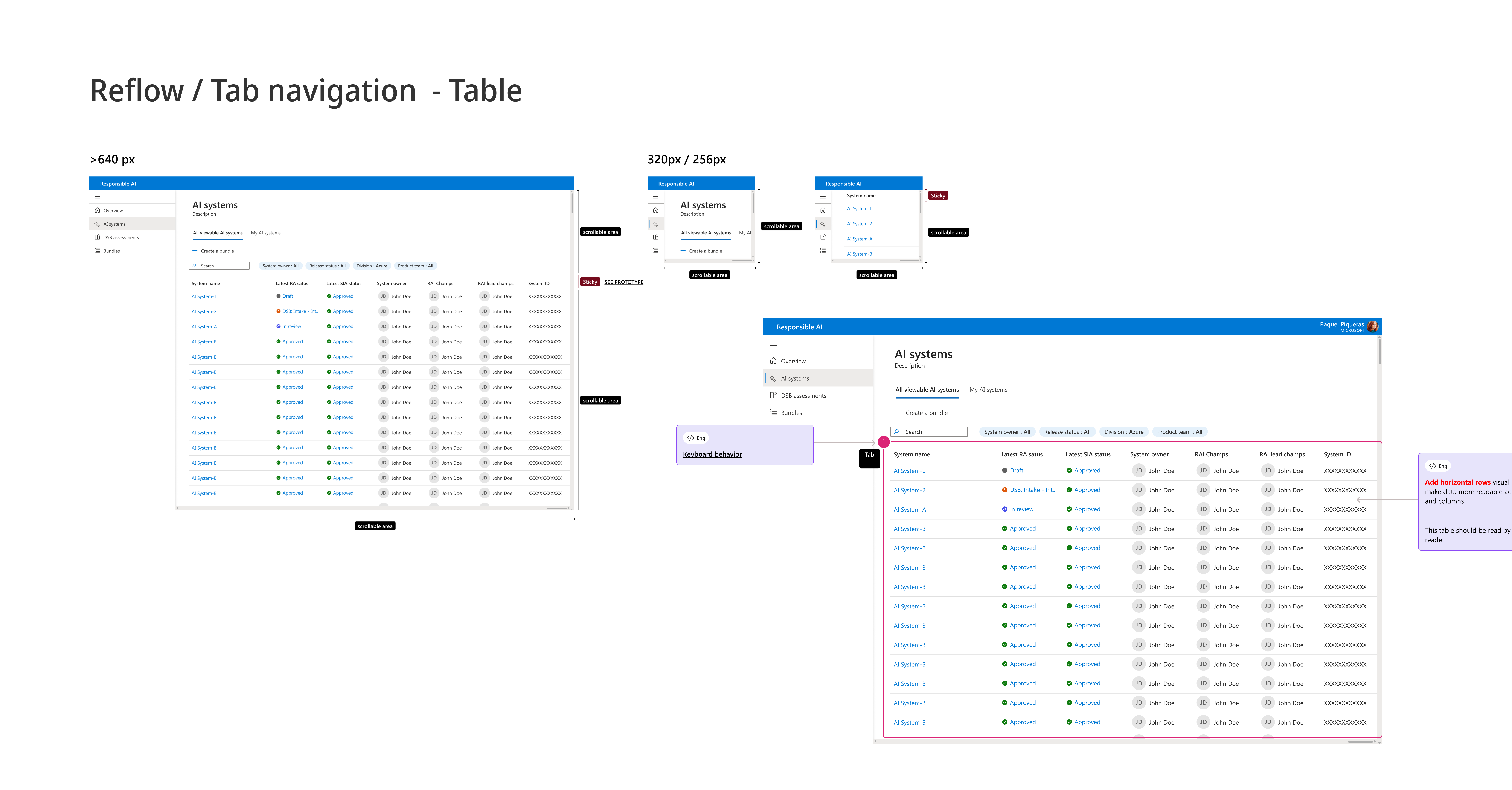
Improving accessiblty
Created design guidance and worked with engineering to implement accessibility updates across screen/button reflow and layout responsiveness.
Outcome: Passed accessibility compliance test for reflow.
Lightweight design system
Created a foundational design system structure to enable faster iteration and maintain a consistent UX across features.
Outcome: Established groundwork for a scalable design system, improved design efficiency, and supported faster onboarding.